Excel-grafiekkleur
Opslaan, invullen, afdrukken, klaar!
De beste manier om een Excel-grafiekkleur te maken? Check direct dit professionele Excel-grafiekkleur template!
Beschikbare bestandsformaten:
.pdf- Gevalideerd door een professional
- 100% aanpasbaar
- Taal: English
- Digitale download (316.74 kB)
- Na betaling ontvangt u direct de download link
- We raden aan dit bestand op uw computer te downloaden.

Zakelijk kleur Grafiek Figuur kleuren Grafieken Excel diagram
How to draft a Excel Chart Color? An easy way to start completing your document is to download this Excel Chart Color template now!
Every day brings new projects, emails, documents, and task lists, and often it is not that different from the work you have done before. Many of our day-to-day tasks are similar to something we have done before. Don't reinvent the wheel every time you start to work on something new!
Instead, we provide this standardized Excel Chart Color template with text and formatting as a starting point to help professionalize the way you are working. Our private, business and legal document templates are regularly screened by professionals. If time or quality is of the essence, this ready-made template can help you to save time and to focus on the topics that really matter!
Using this document template guarantees you will save time, cost and efforts! It comes in Microsoft Office format, is ready to be tailored to your personal needs. Completing your document has never been easier!
Download this Excel Chart Color template now for your own benefit!
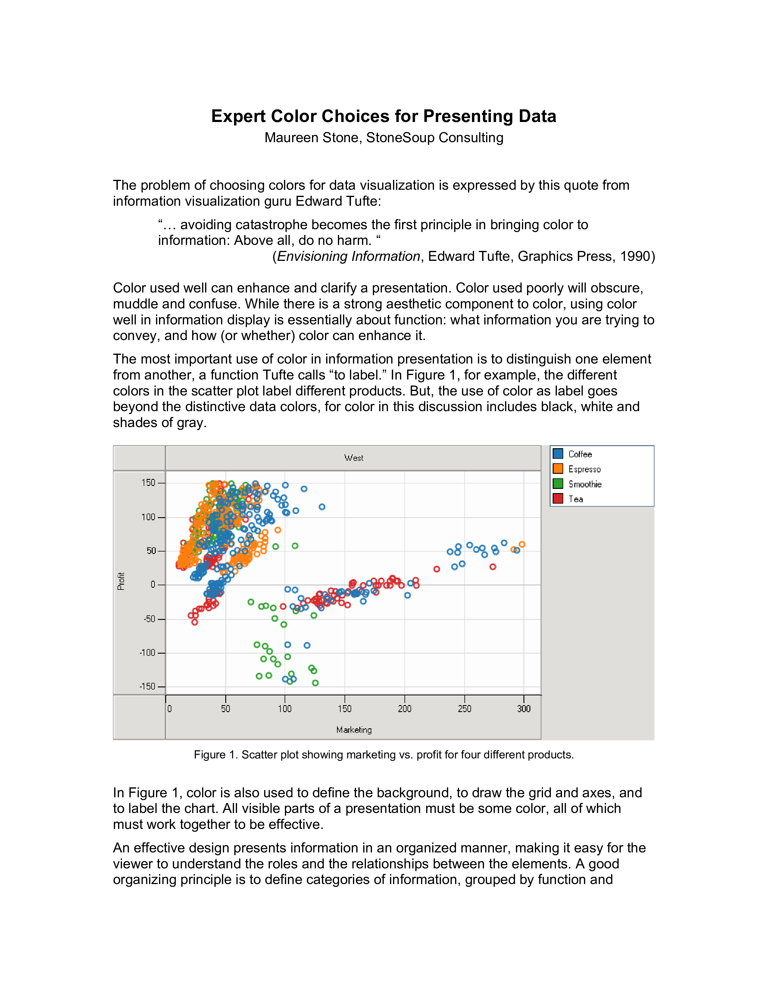
Expert Color Choices for Presenting Data Maureen Stone, StoneSoup Consulting The problem of choosing colors for data visualization is expressed by this quote from information visualization guru Edward Tufte: “… avoiding catastrophe becomes the first principle in bringing color to information: Above all, do no harm.. Given an organized set of data elements, and a clear understanding of their function and importance, how does one go about choosing an effective set of colors To answer this question, we will first look at some basic principles of color design, then the problem of legibility, and conclude with some guidelines for picking colors based on these principles Principles of Color Design Contrast and analogy are the principles that define color design.. Variation in luminance can also used to separate overlaid values into layers, where low contrast layers can sit behind high contrast ones without causing visual clutter (like the grid lines in Figure 1).. (Larry Arend, NASA) The importance of value contrast is why a primary rule in many forms of design is “get it right in black and white.” In an ideal design, all important information would be legible even if chroma were reduced to zero everywhere in the presentation, leaving only shades of gray.. link to the sidebar below entitled “A few words on background color” Acknowledgements All of the data plotting examples (Figures 1, 9-13) were created with the award winning Tableau data analysis software (www.tableausoftware.com)..
DISCLAIMER
Hoewel all content met de grootste zorg is gecreërd, kan niets op deze pagina direct worden aangenomen als juridisch advies, noch is er een advocaat-client relatie van toepassing.
Laat een antwoord achter. Als u nog vragen of opmerkingen hebt, kunt u deze hieronder plaatsen.