HTML Preview Temperature Control Chart page number 1.
1
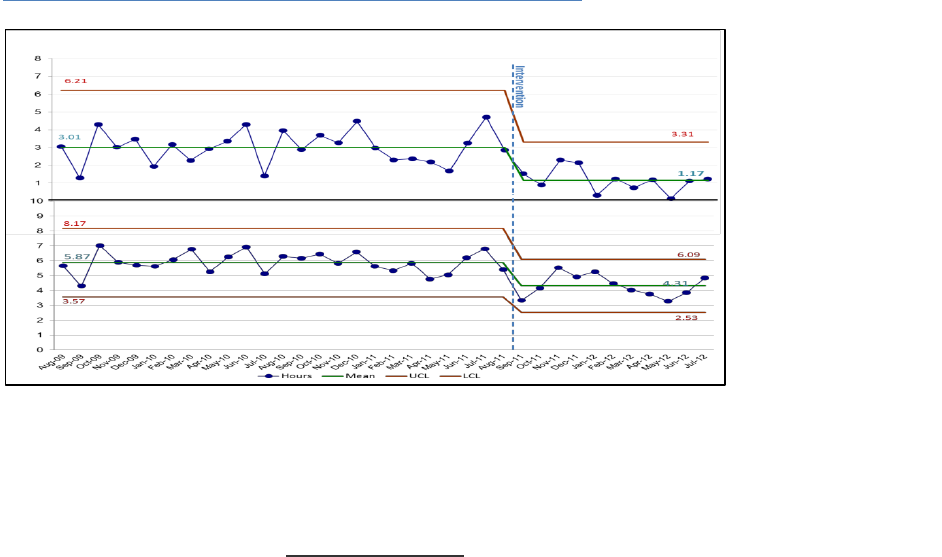
Control Chart
A control chart (also known as a Shewhart Chart) is a graphical display of data plotted over
time. It is a simple tool for understanding variation and it has two general uses in an
improvement project: as a tool to monitor process stability/control and as an analysis tool.
These charts help us understand and visualize the impact of different interventions and tests of
change in real-time and over time. Unlike run charts, control charts show if a process is meeting
its control limits and how much variation there is from these control limits. Control charts are
more sensitive in detecting special cause variation than run charts. The horizontal axis is a time
scale (days, weeks, months, quarters, etc.). The vertical axis represents the quality measure
being studied (e.g. infection rate, number of patient falls, readmission rate). The mean is
calculated and used as the chart’s centerline. Upper and lower control limits corresponding to
± 3 sigma limits from the mean provide the basis for accurate analysis. To determine when data
signal an improvement, the control limits and chart rules are utilized. Goal lines and
annotations of changes and other events can also be added to the control chart. Below is an
example of a control chart demonstrating time to treatment.
Figure 2: Average Time from Admission to Antibiotic Treatment
When to Use a Control Chart
As a core tool for improvement projects to
o Accurately assess whether changes you are making are resulting in true
improvement as you make them
To accurately identify variation and avoid incorrect actions
To effectively communicate results of your improvement efforts
How Control Charts Are Constructed
1. Obtain a set of ≥15 data points in time sequence and plot them in a line graph.