HTML Preview Excel Chart Color page number 1.
Expert Color Choices for Presenting Data
Maureen Stone, StoneSoup Consulting
The problem of choosing colors for data visualization is expressed by this quote from
information visualization guru Edward Tufte:
“… avoiding catastrophe becomes the first principle in bringing color to
information: Above all, do no harm. “
(Envisioning Information, Edward Tufte, Graphics Press, 1990)
Color used well can enhance and clarify a presentation. Color used poorly will obscure,
muddle and confuse. While there is a strong aesthetic component to color, using color
well in information display is essentially about function: what information you are trying to
convey, and how (or whether) color can enhance it.
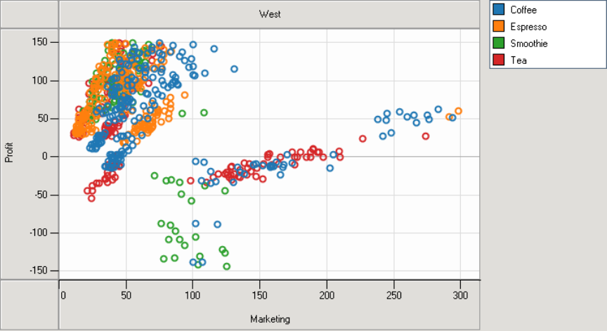
The most important use of color in information presentation is to distinguish one element
from another, a function Tufte calls “to label.” In Figure 1, for example, the different
colors in the scatter plot label different products. But, the use of color as label goes
beyond the distinctive data colors, for color in this discussion includes black, white and
shades of gray.
Figure 1. Scatter plot showing marketing vs. profit for four different products.
In Figure 1, color is also used to define the background, to draw the grid and axes, and
to label the chart. All visible parts of a presentation must be some color, all of which
must work together to be effective.
An effective design presents information in an organized manner, making it easy for the
viewer to understand the roles and the relationships between the elements. A good
organizing principle is to define categories of information, grouped by function and