HTML Preview Statistical Process Control page number 1.
Interpreting Statistical Process
Control (SPC) Charts
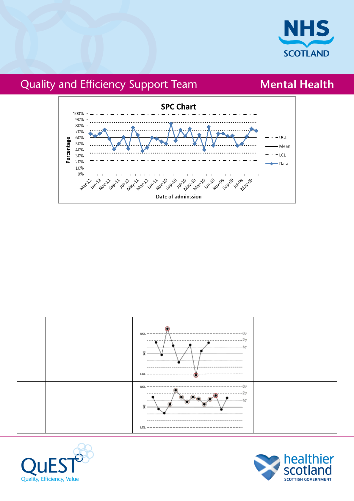
The main elements of an SPC chart are:
- The data itself, which is data in order over time, usually shown as distinct data points with lines between.
- The mean of the data.
- The upper and lower control limits (UCL and LCL), which are set depending on the type of SPC chart.
Usually these are 3 standard deviations from the mean.
Sometimes (and useful for interpretation) the chart will show thirds (1 and 2 standard deviations from the
mean) between the mean and the control limits.
Interpreting an SPC chart
There are 8 signs of special variation you should look for in an SPC chart:
(Nelson rules for interpretation taken from en.wikipedia.org/wiki/Nelson_rules)
Rule
Description
Chart Example
Problem Indicated
Rule 1
One point is more than 3
standard deviations from
the mean.
One sample (two shown in
this case) is grossly out of
control.
Rule 2
Nine (or more) points in a
row are on the same side
of the mean.
Some prolonged bias
exists.