How to create Radar Chart Example
Save, fill-In The Blanks, Print, Done!

Download How to create Radar Chart Example
Adobe Acrobat (.pdf)- This Document Has Been Certified by a Professional
- 100% customizable
- This is a digital download (1394.15 kB)
- Language: English
- We recommend downloading this file onto your computer.

How to make
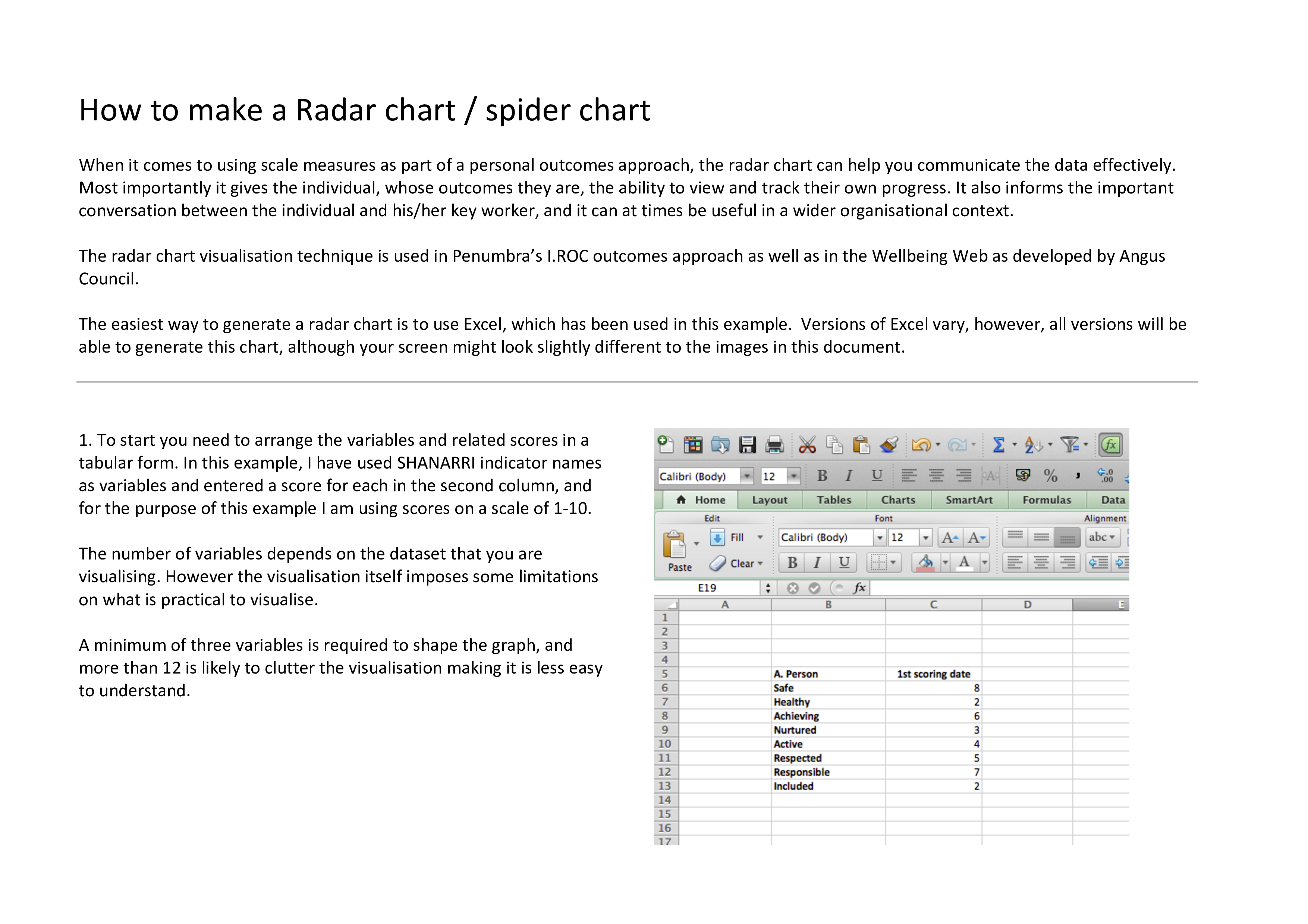
a radar chart example? What is the purpose of a radar chart? Our Radar Chart Example template is the perfect starting point for creating a custom Radar Chart. It's easy to use and comes with detailed instructions on how to customize it. Download this radar chart example template that will perfectly suit your
needs!
Radar charts are especially useful for the following purposes:
A radar chart, also known as a spider chart or a web chart, is a data visualization tool used to display multivariate data in a two-dimensional, circular format. It is particularly useful for comparing the performance or characteristics of multiple items across several different categories or variables. Radar charts are often used in various fields, including business, sports, and data analysis, to visualize and compare data points.
Key features of a radar chart:
- Circular Layout: Radar charts are typically presented in a circular format, with axes radiating outward from a central point, resembling the spokes of a wheel.
- Axes: Each axis represents a different category or variable. These categories are evenly spaced around the circumference of the chart. The number of axes can vary depending on the complexity of the data being presented.
- Data Points: Data values are plotted as points along each axis. The distance from the central point to the data point represents the magnitude or value of the variable for that category.
- Connected Data Points: To create the radar shape, lines or curves connect the data points for each category. These lines form a polygon, and the area enclosed by the polygon can also be filled to highlight differences more clearly.
Radar charts are especially useful for the following purposes:
- Comparing Multivariate Data: Radar charts allow for the visual comparison of multiple variables across different categories, making it easy to see how different items or entities perform across these variables.
- Highlighting Strengths and Weaknesses: By looking at the shape of the radar chart, viewers can quickly identify areas of strength and weakness for each item. For example, in a sports context, it can show the strengths and weaknesses of athletes in various aspects of their performance.
- Showing Patterns and Trends: Patterns and trends across categories can be discerned by examining the overall shape of the chart. If one item's polygon is more expansive than another's, it indicates better performance across the variables.
- Identifying Outliers: Outliers, or extreme values, can be easily spotted on a radar chart. These values typically extend further from the center of the chart.
Common use cases for radar charts include performance evaluation, market analysis, product comparisons, and sports statistics. However, it's essential to use radar charts appropriately, as they can become challenging to interpret when dealing with a large number of variables or items. They are most effective when used to compare a relatively small number of items across a limited set of categories.
Our site is
often updated with new templates.
Download this radar chart example now!
DISCLAIMER
Nothing on this site shall be considered legal advice and no attorney-client relationship is established.
Leave a Reply. If you have any questions or remarks, feel free to post them below.
Chart Template
Types of charts and their uses. A chart is a graphical representation or organizer of data, in which the data is simplified. Check out our collection of Charts
Read moreRelated templates
Latest templates
Latest topics
- AI Cheat Sheet
How to Prompt Perfectly? Check out this 11 Essential AI Prompting Cheat Sheet, the Ultimate AI Prompt Engineering Guide! - Sample Letter of Authorization to Represent
The Ultimate Guide to Letters of Authorization and Powers of Attorney - Nursing Interview Thank You Letter
How to Write a Professional Formal Thank You Letter After an Interview? - Excel Templates
Where to find usefl Excel templates? How do I create a template in Excel? Check these editable and printable Excel Templates and download them directly! - Drop Shipping Agreement
How to start drop shipping? Do you need a Drop shipping Agreement? Check out our Dropshipping Agreement templates now!
cheese